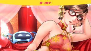
She’s talking about burgers guys. Honest!
Self Critique: On the variants showing the feet, I should’ve elongated the planted foot just a tad bit more. Clavical bone is a bit too prominent. One of the eyes is not smug (i.e. half closed) enough. After receiving a critique about the eyes being too small, I increased them. To be honest though, I think I made them too big, and something closer to its original size might’ve sufficed.
I should bring up other critiques I’ve received in the making of this pic. During the sketch phase, I received a critique from one of my Twitter followers, Teruaki Murakami, about needing to do something with the face. With that in mind, I fixed up a few things here and there an increased the sizes of a few facial features. Bucking the trend of doing the legs first, I instead did the face first. One thing I always noticed but never did anything about was how flat the faces I drew looked whenever they were facing forward, at the viewer. I started shading the eyes a little bit back on the Harriette Easter 2017 pic. But now I did more shading around the eyes, particularly around the brows of the eyes. When I showed a preview of the completed face, the follower I mentioned earlier was none too kind about the results. So I rushed back to the WIP and drafted up several new noses, as well when to the chats of Jet Set Radio Live (cool people) to get feedback on the rest of the face. The end result was a bigger mouth, bigger eyes, and “Version 5” of the nose being chosen. There’s maybe a few things I probably shouldn’t have listened to (the eyes being very big at one point), but I’d like to thank everyone for the help! I hope to take what I learned here to future pics coming up.
Now then, onto the pose. I got it the pose from the Sexual Nude Pose Book and from there when to work. I repeated what I did back on STB-Chan and her legs and used the Free Transform tool on the raised leg to bring it closer to the viewer, then I drew in the details accordingly. I was wondering to myself how exactly I should handle all the stripes on Wendy here. I’m already used to particular method on Chelsí and her striped stockings. But hers are black and white, and Wendy’s are red and white. In the end, the Chelsí method worked. But for the outfit, that one was different. On the base of the outfit, I shaded it in like normal. But for the stripes, I shaded them in separately. I realized by the end of it though that I could’ve just copied the shade layer of the outfit’s base, de-saturated the color to gray, move it above the Stripes layer, Clip it down to that layer, and used a filter. But at least I know for next time!
The environment allow me to flex a bit more muscle on certain things and continue doing my usual thing. There were some new things I did though. For the rod of the table, I shaded it in like normal. But then I took the reference photo I had for the restaurant location, and made two copies for each table. I then scrunched them down and used mesh transform to warp them to the curvature of the rods. And finally, I filtered them through. You can see how I did it over on Twitter. The food I’m probably the most proud of pulling off, in particular the burgers. I was ready to do two of the same burger, but someone on Jet Set Radio Live wondered if I’d do the Baconator. I didn’t think about that. So I did one normal Wendy’s burger, and one Baconator. The shading of them was pretty cool as I used a the Droplet airbush for the texture, the Spray airbrush for the lettuce, the Tone Scrape airbrush for the sesame seed on the regular burger. I also blurred up anything that would sit behind the glass panels.
And with that said, thanks again to everyone for their help!
Done on Clip Studio Paint. Intuos4 Tablet used.
Wendy’s mascot and logo in the back is the (c) of Wendy’s.
Leave a Comment
More Artwork & Updates


My Quiet Little Corner [Xiuying]
No Valentine’s Day Pic

One Night in Mahdad
Yummy Ghosts [Ms. Pac-Man]




![Why's It So Small? Did You Freeze It? [Smug Wendy] (Clothed 1)](https://artofdpx.com/wp-content/uploads/2020/08/Smug-Wendy-Clothed1-1.png)
![Why's It So Small? Did You Freeze It? [Smug Wendy] (Clothed 2)](https://artofdpx.com/wp-content/uploads/2020/08/Smug-Wendy-Clothed1-2.png)
![Why's It So Small? Did You Freeze It? [Smug Wendy] (Clothed 3)](https://artofdpx.com/wp-content/uploads/2020/08/Smug-Wendy-Clothed2-1.png)
![Why's It So Small? Did You Freeze It? [Smug Wendy] (Clothed 4)](https://artofdpx.com/wp-content/uploads/2020/08/Smug-Wendy-Clothed2-2.png)
![Why's It So Small? Did You Freeze It? [Smug Wendy] (Clothed 5)](https://artofdpx.com/wp-content/uploads/2020/08/Smug-Wendy-Clothed3-1.png)
![Why's It So Small? Did You Freeze It? [Smug Wendy] (Clothed 6)](https://artofdpx.com/wp-content/uploads/2020/08/Smug-Wendy-Clothed3-2.png)
![Why's It So Small? Did You Freeze It? [Smug Wendy] (Lingerie 1)](https://artofdpx.com/wp-content/uploads/2020/08/Smug-Wendy-Lingerie1-1.png)
![Why's It So Small? Did You Freeze It? [Smug Wendy] (Lingerie 2)](https://artofdpx.com/wp-content/uploads/2020/08/Smug-Wendy-Lingerie1-2.png)
![Why's It So Small? Did You Freeze It? [Smug Wendy] (Lingerie 3)](https://artofdpx.com/wp-content/uploads/2020/08/Smug-Wendy-Lingerie2-1.png)
![Why's It So Small? Did You Freeze It? [Smug Wendy] (Lingerie 4)](https://artofdpx.com/wp-content/uploads/2020/08/Smug-Wendy-Lingerie2-2.png)
![Why's It So Small? Did You Freeze It? [Smug Wendy] (Nude 1)](https://artofdpx.com/wp-content/uploads/2020/08/Smug-Wendy-Nude1-1.png)
![Why's It So Small? Did You Freeze It? [Smug Wendy] (Nude 2)](https://artofdpx.com/wp-content/uploads/2020/08/Smug-Wendy-Topless1-1.png)
![Why's It So Small? Did You Freeze It? [Smug Wendy] (Nude 3)](https://artofdpx.com/wp-content/uploads/2020/08/Smug-Wendy-Nude1-2.png)
![Why's It So Small? Did You Freeze It? [Smug Wendy] (Nude 4)](https://artofdpx.com/wp-content/uploads/2020/08/Smug-Wendy-Nude1-3.png)
![Why's It So Small? Did You Freeze It? [Smug Wendy] (Nude 5)](https://artofdpx.com/wp-content/uploads/2020/08/Smug-Wendy-Nude1-4.png)


