Gobble Gobble ~ Gobbledine
Say hello to Gobbledine! She’s a well stuffed, evenly seasoned, cooked to perfection Turkey… girl. From breast to thigh, to the neck and the wings, every inch is a mouth-watering feast!
Self Critique: There’s a pretty massive error that I didn’t catch until it was too late. But basically, the lower leg to the right is very small. I should probably stay quite about it, but basically there’s a leaf there not to mitigate the error.
Usually when I wanna do a holiday themed drawing, I pull from my roster of girls to celebrate the holiday. With Thanksgiving… well, there really aren’t that many sexy pics you can do centered around a holiday that’s mostly about eating like crazy. Then it hit me: draw a turkey! And not just any turkey. Draw a girl that is a turkey! So off I went to draw her. In my mind, I was going to draw her with a red faux-mohawk. However I realized that I kept mis-associating my intent with a Rooster. So I looked up images of turkeys, and sure enough they were bald. But they had that red thing on their nose, which I found out is called a “snood”. It’s somewhat unsightly, but when I saw some clip-art interpretations of turkeys, it looked rather cute. So I added that to her nose. When I drew her concept art, I drew her hair with curls on the end to remember the bulbous part of a turkey’s neck. I was planning to make her hair red, but every time I imagined her in full color, her hair looked brown/black. So I made her hair brown first. I switched it to red for a moment, but realized that it looked better brown. The bow would pick up the slack then of representing that red part of a turkey’s neck. The wings on her arms were the toughest part to design. I wanted her to have human hands and not be so harpy-like with claws. In the concept, it was planned to be some kind of glove-like transition to the feathers. It wasn’t panning out so well during the base color phase. But the feathers looked good enough just jutting out of her arms. Maybe in the future I’ll plan something a little more practical but subtle to show her feathers being part of her body.
Speaking of body, I wanted her to be thicc. And I mean DAMN THICC! Who doesn’t love a stuffed turkey after all! So I referenced Bokuman’s tutorial again on thighs, as well as The Fearless* Belinda Cauldron. But I also referenced Posemaniacs for the muscle definition. One thing Bokuman mentioned in his thigh tutorial is to add fat after drawing the muscle. I kept this in mind, and added as much fat as I could (i.e. smudged it a lot). It worked very well on the thighs, as well as in other areas of her body.
Pure Mashed Potatoes ~ Ida
Say hello to the matron of mashing and all things potatoes, Ida!
Self Critique: The thigh to our right is a little thicker than the one to our left. I’m not sure if I did the pelvic right. The mashed potatoes over the ankle to our left could be curved up a little bit to show curvature of the leg.
One thing my family always has as a side for Thanksgiving is Mashed Potatoes. However these mashed potatoes always had red and green peppers in them. When looking up references for mashed potatoes, I also noticed that other people put parsely on theirs. So I added that too ass the straps on her arms, as well as freckles on her shoulders and face. One thing what concerned me was her skin tone. One goa I had in mind for each girl was to have a skin tone that closely matched whatever food they represented while still being believable. This meant that Ida was gonna be very pale. You don’t see it since there’s a filter over her now, but wihout it she’s almost ghost-like. This proved to be a challenge during shading as it was hard to see my shades, especially the highlights. For the design, I thought about things that were wavy and whipped, like how certain mashed potatoes tend to look. So I gave her those bellow-dancer sleeves, and made her hair look like the top-center of a bowl of mashed potatoe. Though I must admit, without color it looks like a poop-hat. I did realize near the end that I could’ve made her hair resemble the gravy you’d put on mashed potatoes. So maybe next year, if I draw her again, she’ll have that change. As for the mashed potatoes itself, I used the Smooth Watercolor brush to get that whipped look.
Shading on her body was a little different to Gobbledine. While Gobbledine was thick, Ida is more petite and flatter than her. Her thighs would remain thick, but her body would be more slender (though not as toned). Mashed potato, while filling, is presented rather flatly when served.
Sticky Sweet Yams ~ Candy
Let Candy sweeten up your meal with her delicious Candied Yams.
Self Critique: The twist of the foot to our left is not as believable as I’d like. The arm to our right looks stiff. Pelvic area seems quite large when transitioning to abdomen.
When designing Candy, I had this idea to make her hair comprised entirely of marshmallows, with some of them dripping. As for the rest of her body, I was thinking of making her whole body just have dripping marshmallows everywhere. But then I realized how much of a pain that would be to shade in. So I opted for something more akin to stockigns and long gloves, but themed after marshmallows. I was tempted to cut holes in her stockings to make it look like a melty marshmallow coating. But I figured it’d clash with the girls who have clothing themed after the food (while still being food you can actually eat). I so didn’t do it. However I did add extra transparent spots on her stockings for a slight melty effect. I did have to salvage a her body at one point from an error I didn’t notice. From her pelvis down was looking much too low. This is the result of trying to accomodate for the reference pic I had that saw the angle being a bit higher than everyone else. So early on in the shading process, I was able to section off that area and move it higher. It’s not a perfect fix, but it looks more natural that how it looked before.
Since it was most effective here, I wanna talk about the watercolor brush. I noticed that many Japanese artists (and another artist as well, but I don’t think he’d want his secret spoiled if not watching his livestreams) using watercolor brushes for shading. A buddy of mine on JSRL also uses watercoor brushes for his artwork too. I asked him to link me to a tutorial video he watched on Watercolor brushes. The main gist of the tool is to lay the foundation, then softly run along the edge of the shade, and then you’re done. I tend to stick to my tried and true Aibrush/Smudge combo, but it can be time consuming. So with dish under eatch girl, as well as some of the food, I shaded them entirely using only the watercolor brush. And holy crap was it useful! And it cut down the time it took me to shade in everything by a lot. The brush got the most effective usage here. The yams came out looking very nice. I was even able to make them have that rough-ish texture they have. And the marshmallows, which I dreaded doing since there were so many of them, and overlapping too, were very painless to shade in. Even adding the burn marks was a breeze (after I looked at my reference again).
Careful not to indulge in candied yams too much. It’s high in sugar. It can be very addictive, and probably make you crash ;P
No Room For Cornbread? ~ Muffin
People always forget about Cornbread. They eat all the other food, get full, and totally forget about the cornbread. This makes Muffin mad, especially since she puts a lot of love into them. It’s not like you’d have enough room for cornbread anyway, idiot!
Self critique: The hand on the cornbread, her thumb, anyway… kinda looks weird. I should’ve drawn the cornbread between her legs a but more in front. The lower leg to our right looks too long and should’ve been shortened some.
Of all the girls, Muffin was the toughest girl to design. When I was designing her, I was already pretty tired from thinking up and drawing the other girls. And it late at night while I was watching Toonami. I conceded to continue the next day. When I looked the next day, it was so horrible that I threw it out. All the other girls were easy to figure out design-wise. But how to do make Cornbread look sexy. Heck, how do you make anything at all with cornbread!? So I looked up more references, and noticed that some people put butter on the tops of cornbread. So that got me thinking of making her hair blonde to resemble the butter. I also decided to give her something of a butter-like open bra. And then… a happy accident occurred! When I was drawing the bra-straps in the concept sketch and added the a few wrinkles, I noticed that it looked like the straps to a backpack. “…screw it! she now has a Cornbread Backpack now!” She was planned to have a tsundere personality, but then had the added schoolgirl part added with that backpack, so I rolled with it. The butter ribbons under her boobs are also part of the backpack. Her name was also a pain to think up since they all came out rather… well, corny. I remember having a box of Jiffy cornbread, so I looked at it to get some ideas. Immediately I saw that it was corn muffin mix, and not cornbread mix. However the ingredients to make both are the same, it’s only the process of baking them that are different. So I settled on naming her Muffin. I guess you could say all my frustrations on designing her made her a frustrated tsundere!
She was gonna have a petite body-type just like Ida, but with flatter boobs, much like the cornbread she makes. But like everyone else, her thighs were gonna remain thick. I did realize during the base color phase that she almost looked like Ann Takamaki from Persona 5, only difference being her cornbread hair ties and having brown eyes.
A Hearty Tradition ~ Berri
The oldest side dish of the meal, deserves the BIGGEST respect. Berri’s here serve you a heaping helping of cranberry sauce.
Self Critique: The bend of her foot could be executed better.
I tried to think of a more clever name for her, but all thoughts kept going back to Berri.She’s the only one to see a design change from her concept sketch. At first, the top of her head was all cranberries, with the rest of her hair looking like sticking cranberry sauce. However, like Muffin, I did her concept sketch in the middle of Toonami, and quite late into the night too. I was starting to feel fatigued by that point. When I started up her sketch phases, I changed her hair to looking more normal, but having the cranberries now take on the form of a hair band. Her initial design also looked like she was wearing part of a Kimono. I started shifting it more and more to something akin to some kind of medieval fantasy princess, removing the bottom half of her outfit completely, leaving only the sleeves. Of all the girls, Berri was going to be the thickest girl, even thicker than Gobbledine. Now was a good chance too to try drawing a chubby belly in a neutral state (they’ve always been in a resting position or in weird angles). I also tried out something new with the nipples, making the areolas more recessed and not as puffy as I usually draw them. This involved smoothing out the whole areolas after combining the shade layers, then lowering the opacity of the areola. The results came out way better than I expected.
The cranberry sauce under her also helped me get more used to using the watercolor brush, especially on liquids. I tried out using a different watercolor brush that had a texture on it. since the references I had showed it having a texture. It came out pretty good. I added several cranberries rolling off Berri’s thighs too during this phase of the drawing as well.
All girls done in Clip Studio Paint Pro. Intuos4 Tablet used. Models referenced for all pics.
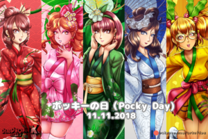
Gobbledine, Ida, Candy, Muffin, and Berri are (c) DeadPhoenX.
Leave a Comment
More Artwork & Updates

Youkan’s Tickle Machine
Happy Holidays From Chelsí and Belinda!
Chelsí’s Summer Fashion
Too Hot To Handle [Twintelle (ARMS)]
The Seagull Restaurant Breakfast Special


