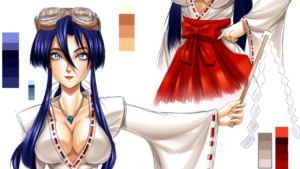
After nearly a decade of not drawing her, Princess Peach has finally returned!
Self Critique: The hand to our right should’ve had the space between her forefinger and her index filled in. Both hands should’ve probably been made slightly larger. For the wings, it would’ve been better to have those lines on the feather be less numerous, or at least not as noticeable.
Finally I get some artwork out! While I was celebrating my 10th Anniversary, I was thinking of old pics I could redraw with all the improvements I’ve made over the years. And what better way to kick things off than with an old favorite. Back when I started this whole digital art thing in 2006, I was known for drawing Princess Peach quite often. What kicked things off was an old drawing I did called Peach Heaven. I deleted the pic from my gallery a couple of years later out of frustration and swore off drawing her again. As time (and college) went on, those feelings of frustration waned to the point where it doesn’t really bother me anymore. And now that I got better at drawing, I figured I should draw the very pic that put me on the map as a Peach artist all those years ago.
Looking back at that old 2006 pic, things weren’t going to remain completely the same. For starters, There would be a slight change to the pose, lifting both arms for something of a more playful pose. Next, those legs would be drawn properly. I would reduce the ridiculous amount of wings on her to a more standard two, as well as decreasing the size of them. The design on her stockings would become a more lacy design. And finally, I decided to add a pink ribbon to sort of make up for the removal of one of the wing pairs.
One of the things that I wanted to get right that always stumped me when drawing it was her hair, particularly the top of it. Back then when I drew her hair, I was going based off of her 2D art from Super Princess Peach, which was drawn as one big clump. In her 3D renders however, her hair was separated in two parts: the mound that is on top of and in front of her face, and the mound in the back. This time I around, I decided to do away with the old method and do things differently, referencing the 3D renders and the way SigurdHosenfeld did her hair back then (and I think does now, if he ever comes back!). The end result was better than what I expected, and will be the way I draw her hair going forward. And yes, I gave her more hair for this pic than she usually has.
Moving to the background, I decided I’d make things more detailed than I did in 2006. Part of the design of the background, again, was based off of Super Princess Peach. I would retain at least the design of the mountains in the back, but make them more detailed to match what I do now. As for the mushrooms, I decided to reference the mushrooms from the Mushroom Gorge track from Mario Kart Wii instead of the standard mushroom shapes from most of the Mario games. The mushrooms from MKW have that hump in the middle and look like they could be sat on. The stems though I references real-life photos of mushrooms.
Moving back to Peach for a moment, during one of my Art Experiment Sundays, I came across a Clip Studio Paint tutorial from Wacom from a Japanese artist. It was just a shading tutorial, however I noticed that he was using the watercolor brushes. I also saw a tutorial/rant video where an artist was painting using the oil paint tools in Clip Studio Paint. I gave them a shot, and it gave me an idea. I decided to try painting the feathers of the wings with Oil Paint, so as to lessen the work I would’ve had to do if I tried drawing each one individually (and I really was going to do that). But sure enough, things looked much better than I expected. As I stated earlier, I should’ve left out those dark lines on there, but there’s always next time. I would then use the watercolors on the clouds in the background as using the airbrush wasn’t working as well as I thought. And again, it looked great. And I only needed two colors! Trust me, if I was gonna do the usual method, I’d be using 5 colors! Also, I made sure this time to keep the clouds to the bottom. In the old pic, you can see that there are clouds higher up. When looking up references for what it looks like above the clouds, there’s nothing further up, just the sky. Given, there were some photos with clouds further up, but that just means that the clouds at the bottom were the low-hanging type. Things were looking empty though. So I added wind lines like those seen in The Wind Waker.
I gotta say, looking at my old 2006 pic and comparing it to this pic I did in 2017, I’m very pleased with the results and how far I’ve come from those humble Peachy beginnings!
Done on Clip Studio Paint Pro. Intuos4 Tablet used.
Princess Peach is © Nintendo.
BONUS!
Seeing as this is a remaster of an old pic I did in 2006, I had to compare the old with the new to see how far I’ve come along.
(Draw This Again is the next image in the carousel)
Can’t believe it’s been this long since my first big Princess Peach pic. Back then I used an old program called Micrografx Picture Publisher 7 and used only a mouse. I’ve since upgraded big time, now using Clip Studio Paint Pro and an Intuos4 tablet, as well as using the Figuarts Body-chan model.
Fun Fact: I ended up removing the original 2006 pic back then out of frustration (you can read up on that on the Remastered’s page). But when my old pic died, the original Peach Heaven went with it. Thankfully, the the guys over at Paheal Rule 34 saved the pic (along with others) and uploaded it there. Without them, that pic would’ve been lost forever! So shout outs to those horndogs at Paheal. If you’re from that community, send them my regards!
Leave a Comment
More Artwork & Updates

My Quiet Little Corner [Xiuying]
A Lot To Wallop! [Cala Maria – Cuphead]
A Poacher’s Nightmare – Hannah Dundee (Cadillacs and Dinosaurs)
WIP Artwork ~ The Making of Hannah Dundee
Who Are Those Chibi Characters? [10 Anniversary Special][Updated!]





This Post Has One Comment
Pingback: A Lot To Wallop! [Cala Maria – Cuphead] – Blue Fish Apartment