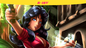
This artwork contains NSFW variants within the carousel. Proceed at your own risk.
I like my coffee with some French Vanilla.
Self Critique: The rim lighting on the knees didn’t turn out the way I wanted it to. It looked okay until I filtered it through. The planning for the crown wasn’t fully thought out. I tried to add some depth (or thickness) to it, but the layout of it all wasn’t too friendly to my attempts. As such, it’s flatter than I’d like it to be. The hand on the floor is okay, but I know I can do that better if I can find the right reference. Also, the hand holding the cup could do with the thumb going upward instead of outward. The coffee on the ground doesn’t look as good as the coffee that’s falling on her.
Cranked out a new one in record time! This is the coffee girl that Gashi-gashi created and posted to twitter (and finally put up on DeviantArt). He calls her STB-Chan. A whole bunch of people were were doing fanart of her, and it looked like fun to do. So I went ahead and joined in too! I’ve actually been a fan of his for a while (roughly since that dumb incident that happened on Tumblr when people were giving him shit, and when are they NOT giving an artist shit for the dumbest reasons). He’s got a cool style that’s a mix of anime and 90s Cartoon Network/Kids WB! cartoons. So if you like the idea of that, go check him out!
As for this pic, I wanted to do something with a lot more perspective than before, once again with the feet being closer to the viewer. Back then with the MML Amelia pic (Best Legs In Kattelox) I attempted perspective, but it wasn’t very successful. This time around, I did something that I saw a Japanese artist do on Twitter. When he was making his sketch, he intended to do a low angle pic with full-body foreshortening (as well as tilting it). Once he sketched the characters, he enveloped them in a Selection and used the Perspective tool to get the desired foreshortening effect. Of course the characters would looked stretched as if they were being sucked into a vortex. So he redrew them again, this time with the proper perspective you would expect them to be at a low angle, and with proper foreshortening in place. I pretty much did the same thing here. During the Schematic phase, the girl’s body would stay put, but her legs would get the Perspective tool treatment (better still since her legs are their own layer during this phase). So I pulled her legs further away from her body while keeping her thighs closer to her body. Then during the 1st Sketch Phase, I drew out the legs with the proper perspective. You can see more of what I mean over on Twitter.
There isn’t much more I can say about the design process. Background was gonna be very simple with STB-Chan’s catchphrase “Drink It!” on there (it previously said “Drink Up!”). Overall this was good practice with the perspective tool. Now I don’t have to use it for just floor shadows!
Done on Clip Studio Paint. Intuos4 tablet used. Model referenced.
STB-Chan is (c) Gashi-gashi.
Leave a Comment
More Artwork & Updates

Boop, Got A Nine! [Mrs. Game & Watch]

A Warm Bath With Mei

What Am I Going To Draw Today?
No Valentine’s Day Pic

Marian Win! (Double Dragon)




![Freshly Brewed Coffee [STB-Chan]](https://artofdpx.com/wp-content/uploads/2020/08/Gashi-Gashi-Coffee-Girl-Covered-Small.png)
![Freshly Brewed Coffee [STB-Chan] (Uncovered)](https://artofdpx.com/wp-content/uploads/2020/08/Gashi-Gashi-Coffee-Girl-Uncovered-Small.png)


