First of all, required listening!
Self Critique: The elbow to the right looks weird. I probably should’ve shaded in that one knee one step further so that it doesn’t look so knobby. One too many lineart wrinkles on the dress. Should’ve left it to the shading.
Note: if you want to read about the process of doing the background, check out the widescreen version
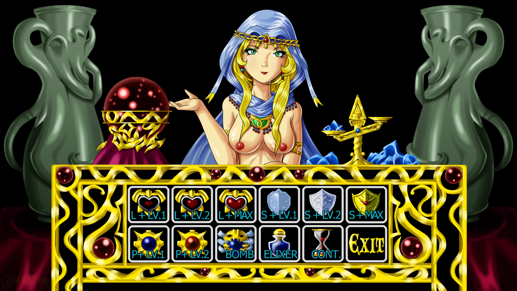
Here it is, the woman that kicked off the trio of shopkeepers. For ages I’ve been wanting to do fanart of the shopkeeper from Lords of Thunder. Once I got my chance, I ran head first into one hell of a brick wall: there is no official art of the shopkeeper at all. She doesn’t even have a name. I tried looking in both English and Japanese and came up empty. So I had to make due with what I had: the in-game Sega CD and Turbographx-CD version of the game. She had slightly different looks when comparing the two versions. But being the sucker for red lipstick, I chose to go based off the Sega CD version. Once I was ready, it was off to draw her. Having no reference from her bust down, I had to improv what she might look like during the concept stage, refining a bit on the sketch phase.
One thing I was proud of, though it was kinda minimal, was drawing the chain on her hood. I don’t draw chains all that often due to their intricacy, and when I do it’s always these types (www.psdgraphics.com/file/seaml…). But I had to bite the bullet and do it. Thankfully, I had an old pocketwatch (yes, really) that had a pattern that matched the shopkeeper’s chain. I did some prelim sketches on the concept stage, fucking it up a bit at first. but once I got the hang of the rhythm, it became natural. The next thing was coloring it in. You can’t see it here since I resize my pics on dA, but I did something slightly different when coloring the chain, which I then applied to the background. I’ll get more into detail on the widescreen version.
Don’t have much else to say, other thank rock on to all the Lords of Thunder fans. Seriously, if you haven’t done it by now, go listen to the Lords of Thunder ost. It’s fucking beastly!
(TG-CD version)
(SEGA-CD version)
Mockup Screen
Self Critique: I kinda wish I could make those diamonds reflect light much harder. They always look cheap when I do them. The S+LV1 item looks…eehhhh.
So much like the shopkeeper herself, the only reference I could work on was from the game itself. Like Forgotten Worlds HD, I had to somehow accommodate the shopfront to the widescreen format. Since we never really saw the edges of the thing in the original game, I had to make the up. I figured something simple would do the trick, as well as adding red orbs on each side. Admittedly, I did trace what was visible for the shopfront, as well as the items there. What I had to redraw from scratch though was the balance scale, the big globe, and those vases (well, one of them) in the back. The scale and globe were not much of a problem. The vases though were a big difficult since in the original game, a HUD would cover them. From what I could tell, the vases looked kinda draconic. I tried my best with what was visible and improvised with what wasn’t. Once that was done, I painted it in and then duplicated. This time around I put them further apart from the shopkeeper to occupy the space to the side, and added platforms under them.
So about shading in the gold of the shopfront, as well as that chain on the shopkeeper’s head that I mentioned on the portrait version. So I would shade in the gold like normal, except this time the darkest shading would be placed in the middle, followed by a white streak that would run parallel to it on the “bright side”. The results looked pretty good. I pretty much did this for every gold thing what wasn’t rounded, like some parts of the balance scale.
I guess I’ll end it with a cut idea. I could talk about this on the portrait version, but it’d be better to talk about it here. Originally that pose I drew for her was intended for her to actually hold onto the item that the player would have selected. Not the item in its full size mind you, but the same icon in an orb similar to the ones you see all over the counter. I started getting pretty exhausted buy the time I finished the items, the last thing I worked on, and wanted to see this done already.
In the end though, all the hard work paid off.
Done on Gimp 2.8. Intuos4 tablet used.
The shopkeeper character and Lords of Thunder are (c) Hudson.
More Artwork & Updates


