And now for something a little different from my usual fair.
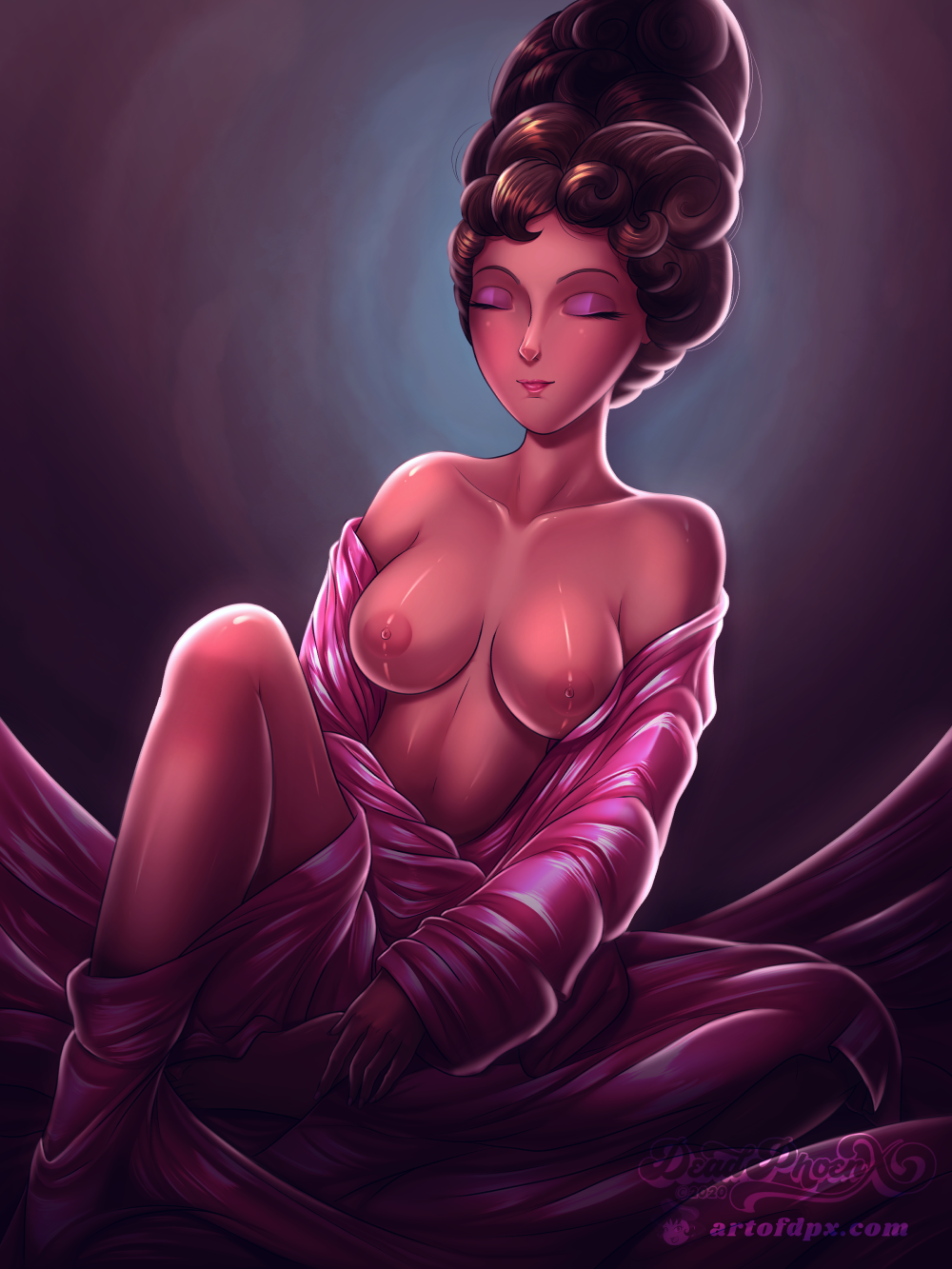
Self-Critique: I’m not quite jazzed about how “slanted” her face looks. Some aspects of cloth’s highlights I should’ve done differently, particularly around the arm that’s reaching for the ankle.
This one is pretty late getting uploaded as I finished this back in September. This piece was commissioned by, of all people, the wife of my building’s super. It was a unique commission to say the least. She found out that I knew how to draw, and wanted me to do a redraw of an old painting that was stored her building’s basement (her husband is the super to 3 buildings). The painting, which you can see here, was very old and most likely done around the 1960s. It was pretty beat up, with a large gash across the bottom and a worn out frame and stretcher bar. The painting looked to be acrylic on cloth, and was probably painted for a bar that used to exist within the neighborhood back then. I did a Google reverse image search to see if the original artist could be identified. Sadly results turned up nothing with neither the artist nor the model ID’d, nor if the painting was a one-of-a-kind or a replica. She asked of there was any way for me to restore it, which I declined since that wasn’t within my field of art. However, I did offer to redraw it in my style. She already liked my other artwork a lot and didn’t mind if my take was more stylized. It was also to be printed and frame, total size being 24×36. Needless to say, she was ecstatic with the end result and was very appreciative.
Now then, onto the artwork itself. The pic was more-or-less straight forward. There were a couple of attempts to get the sketch to canvas. I used the Body-Chan model and a photo reference from one of my Pose Books to get the construction lines down for the pose. The first attempt saw me overlaying the lines on top of the painting, but it just wasn’t working well. So started over I settled on just eyeballing the placement of some body parts and positioning them in ways that made sense to me. Design-wise, I did have to teach myself how to both draw and color in a beehive hairstyle. As complex as it can be, the end result of doing such hair looks really cool. There was one other aspect that was a bit contentious that I wasn’t sure of due to the age of the original painting and the possible color stylizing present in it, but I’ll leave that to a WIP Artwork post on the Blue Fish Apartment.
The background was something that I kinda wanted to try out at some point but never had a chance to. It’s possible that when the original painting was done, the artist had the model sit in front of one of those dark, indistinct watercolor backgrounds. You know the ones, like when you were a kid getting your picture taken for school photos back then (I sure remember, I looked like a damn dweeb!). But I digress. The process was incredibly simple. It was really a matter of creating a gradient, and then running the colors through with several watercolor brushes (with the occasional Light Running India Ink).
Overall, the result came out great. And it looks awesome in printed form!
Done on Clip Studio Paint Pro. Cintiq 16 Tablet used. Body-Chan Model traced for construction lines. Model reference.
Original Painting is © Unknown Artist and Unknown Model. Notify me if ID’d so that I may properly credit them.
Leave a Comment
More Artwork & Updates


Look At All This Candy! [Halloween 2017]

Dressing for Mischief – Jucika
Glamorous Ladybug [Lady Bug Arcade]
Please… Gimme That Chocolate Carrot!
WIP Artwork ~ The Creation of Wu-Ruixiang


