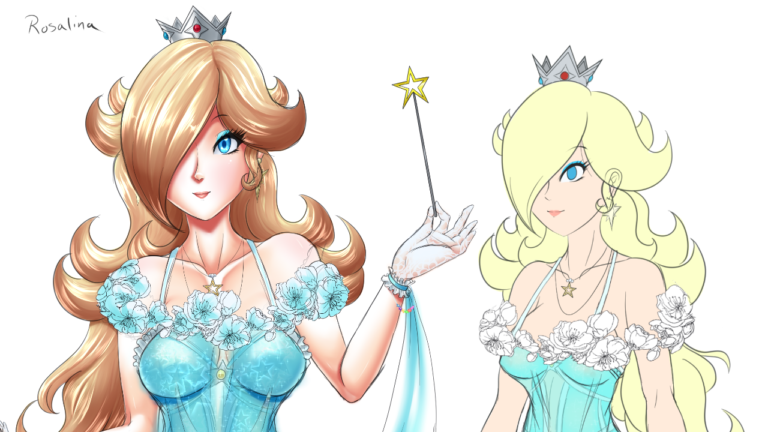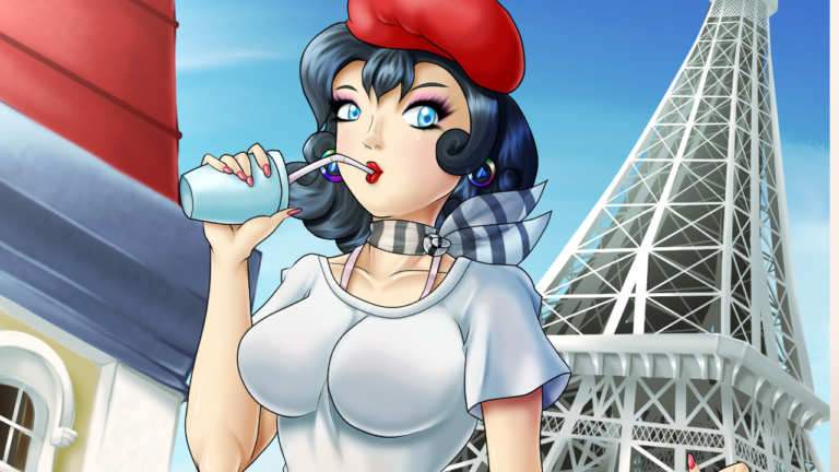
Girl’s gotta change looks for Summer. Having a ribbed sweater’s way too hot!
Self Critique: The hand holding the bag could have the palm look better. The perspective of the shirt wrinkles changes between high and low angles when they should all be low angles (from below). Probably gonna need more practice drawing the Eiffel Tower.
This pic was actually supposed to be uploaded earlier this Summer, roughly around late May/early June. The reason for the huge lateness is because I finally changed programs, switching to Clip Studio Paint. This is actually the second pic I worked on with the program, while also first for the background). I’ll explain more on my reasoning for switching when I upload the first pic I did on Clip Studio. For now, let’s talk about Chelsí here.
I wanted to do another Summer Pic similar to last year’s Condado Beach. However instead of putting Chelsí in a beach, I wanted to do something different that had me doing more building practice as well as giving Chelsí a different outfit. So that’s when I decided to pit her in the middle of Paris, close to the Eiffel Tower. If you saw outside the window of her studio/living space (and maybe squint hard enough), she actually lives quite far from the tower. Regarding the outfit, I opted for something simple and not too crowded like her usual outfit, while still having identifiable features like the striped ascot around her neck (in place of her striped scarf). The stockings would remain of course, though with a thinner hem. I was thinking of giver her black shorts, but usually black doesn’t mesh well with the heat of Summer, so I made it to blue. Unintentionally, she’s now in French flag colors! I also did her hair more curled up than usual. Moving to the shirt, I wanted to make it the slightest bit transparent. I didn’t draw a body under the shirt (sorry to those expecting a less-clothed variant), so instead I put down light tones in spots where her body would peak through the shirt.
Moving to the background, I would more or less continue doing structures free-hand. I pulled in some references of old-school French houses, stores, and apartment buildings, as well as the Eiffel Tower. The location around here of course is not a 1:1 recreation of what it might actually be around the Eiffel Tower, and unfortunately nor is the Tower itself. I did try my best though. Usually I’d wing the tower like I did with Ready to Paint, but I can’t do that if it’s so up-close. It was actually made tougher due to the tilted low-angle perspective (we’ll get to that). I found it easier to just do a pyramid for a blueprint and fill in details on sketches, then laying base color. I also switched to a head-on reference for the Tower and putting the low angle one I had aside since, quite frankly, I didn’t know what the specific details of the thing looked like. But, as I said in the self critique, I’m gonna need more practice doing that if I draw Chelsí this close to the tower in the future.
Finally, let’s talk perspective. On Pixiv, I notice lots of Japanese artists doing many dynamic angles, and quite a few almost effortlessly. So I wanted to try that out here since I always do normal head-on angles. On top of that, I was going to tilt it as well for a more dynamic look. The tilting was going to happen after the 2nd sketch phase was completed. I put down a guideline showing the original orientation and the tilted so that I didn’t lose by bearing during shading (the canvas view was rotated constantly to make shading easier, but I could lose where the light was coming from, hence the use of guidelines). I did the same thing to the background as well, drawing it at a low angle at first, then tilting it after the sketch phases were completed.
This wouldn’t be the first time I’d try out low angles. I actually have another pic I did that still needs the background done. Clip Studio Paint is a godsend.
Done on Clip Studio Paint Pro. Ituos4 Tablet used.
Chelsí Pleinair is (c) DeadPhoenX. Permission not required for non-profit purposes, but credit with link back is needed.
More Artwork & Updates


