*inhale*… *exhale*… God that was lot of work!
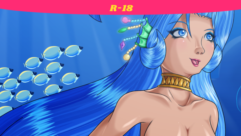
Self Critique: The shiny part of the tail fin spines (?) don’t quite line up with the darker ones. Her nose as a little snout-y. Looking at her arm to the right, I might have to study up on on the inner bend of elbows so that I know how to shade it. I keep looking at the distant mountain in the back, wondering it I should’ve added an outline to it. I have a feeling that I should’ve. Those pink things… yeesh. They’re supposed to be corals, but they look like shit. Definitely gonna do better on those next chance I get.
Okay then, there’s much to cover here. First the mermaid. Like Rhapsody and Harriette, this is a character I once drew way back in 2005. They’re all actually part of a series of pics I did on myhtological ladies. These pics never got uploaded here. Could I be drawing more of them in the future? Who knows. This mermaid does have a name, though I’m not digging it all too much since its a common name I said for mermaid characters. I should have a name on her when I draw her again some day.
Anyway, one thing I wanted to do with much detail was the scales of her fish tail. Each of these were done freehand with Smooth stroke activated. For the part of the tail that becomes the fin, with the brush starting at 100% opacity, I lowered the opacity by 20% after each row, then by 10% when I hit 20%, as well as disjointing the scales. Recalling some artwork I saw on Pixiv, as well as a tutorial video by ChubyMi (and sakimichan‘s artwork to an extent) I’ve been moving more and more to not using black/no outlines for certain body feature. Chief among these features was the nipples, lips, Tail-fin spines, and the spines (?… those lines) of the dorsal and ear fin. These are basically features that, with how I do things, would have very thin, black lineart. I would’ve considered simply using lineart with color that is close to the feature. But with the process of how I do these, Base Color comes after digital inking. And since I wouldn’t know what color and how dark the color will get in certain spots, it’s better for me to just not do the lineart for those. Looks more natural no?
I pulled all the stops and went for broke on the background. Again, referring to artwork from Pixiv, Sakimichan, ChubyMi, and several anime like Michiko & Hatchin, I wanted to do a painted background. You saw me do this with Condado Beach last time, though I traced the shape of the buildings in those and everything was very structured and man-made, only getting a chance truly flex with the dark-gray cliff in the back of that pic. Here, it was all bent to the will of nature. All freehand. Lets start with the rocks. I did a dark blue structure, almost like a silhouette. I then filled in different spots with a lighter color. Speaking of which, I usually jack the airbrush flow to 100%, and the brush spacing at 1%. This time I left it at its default 10% and spacing at its default 10% so that I can pull off what I had just done. I changed these values depending on the takes at hand, sometimes switching to the paintbrush tool for something harder. Anyway, back to the rocks. I wanted to do these using less layers than what I’d probably use, and left each feature flow naturally into each other so that I can blend them together at the same time within the same layer, as well as with less time-consuming busywork that I tend to find myself doing with these. I gotta say I impressed myself with this. I did the same to the arch (which is covered by the mermaid). I didn’t do this with the mountains in the back since they’re far away (distance from viewer+low visibilty=low detail/no detail/silhouette).
The plants were another thing I had to figure out. I pulled up several references again of aquatic plants to get an idea of what to do and how to do it. Since I had just painted these rocks, I figured out which brushes I’d have to use. This wouldn’t be the first time I’d do seaweed, but I wanted to do them better. Since they were large, I handled them like the rocks. With smaller plants, I was dependent on the brush types to get the shapes I wanted.
Next came the sea life. First was the relatively easy yellow fish all the way in the back. Of course, the closer the fish are, the more detailed. So I looked up different fishes and picked the best looking ones. Just like the rocks, I freehanded all of them with Smooth Stroke enabled and changing the bush’s mode and opacity when needed. And not wanting to constantly do more of the same type of fish by hand, I simply copied the one I finished so that it saved temporarily to the clipboard, which then becomes a temporary brush. It was then a matter of picking a spot, fixing scale and rotation when necessary, then clicking. My favorite of the bunch was doing the jellyfish.
I’m running this description pretty long, so if there’s anything in this pic you want to ask me about, ask away.
Thanks to the Pixiv community, sakimichan, and ChubyMi for the references and tutorials.
Done on GIMP 2.8. Intuos4 Tablet used.
This particular mermaid-with-no-name is (c) DeadPhoenX. Permission is not necessary, but credit is required with link back.
More Artwork & Updates

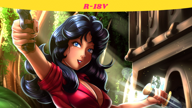
A Poacher’s Nightmare – Hannah Dundee (Cadillacs and Dinosaurs)

[Commission] The Cat Burglar – Ms. Fortune (Skullgirls)


