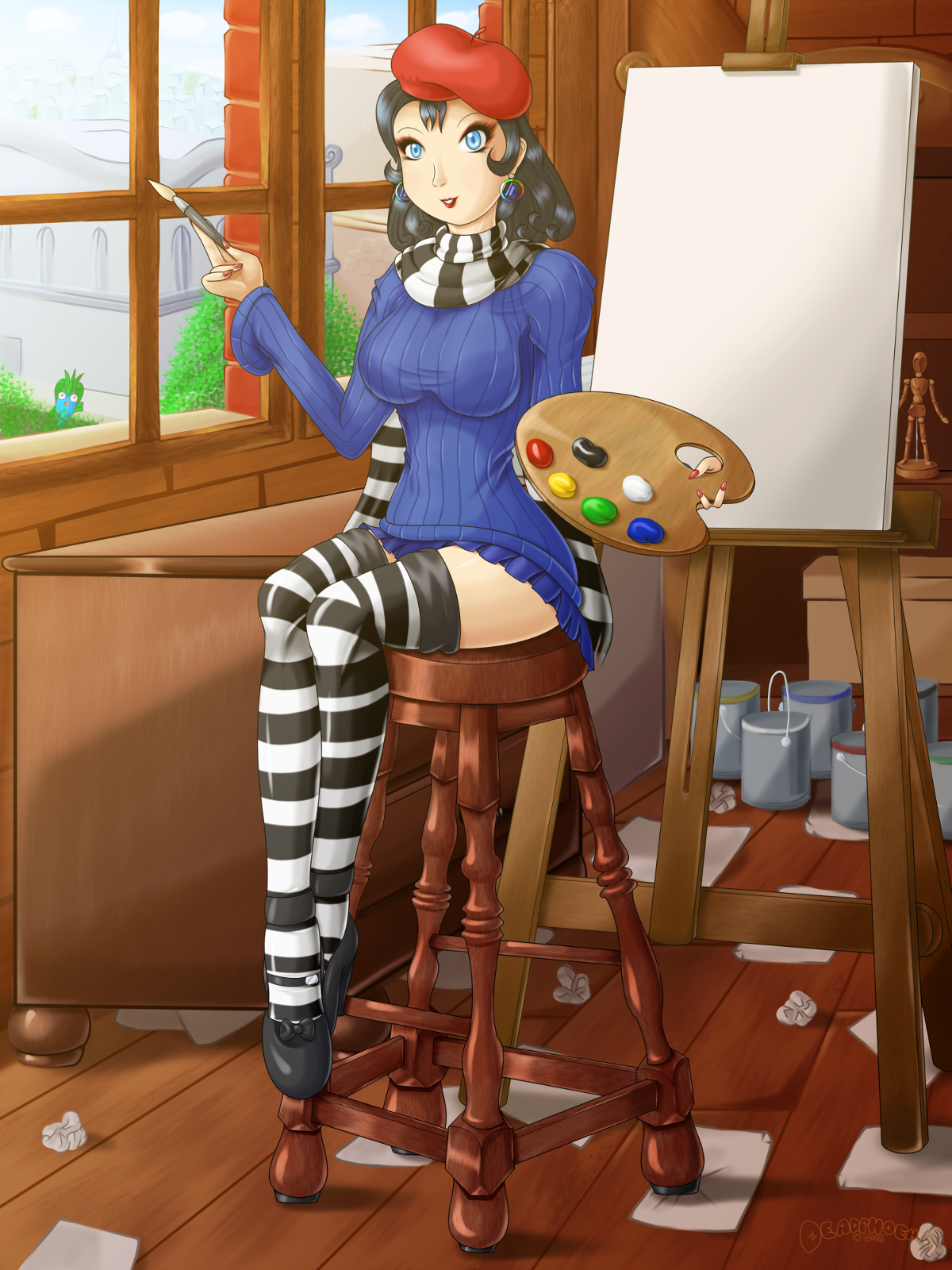
Chelsí’s back! Don’t mind the mess, comes with being an artist.
Self Critique: The hand holding the brush is rather strange. The outlines on the paint cans in the back should be darker.
Out of all the pics I did in this current batch of artwork, Chelsí’s was the one that would challenge how I did backgrounds. But first let’s start with her. The original sketch had her with no stool, palette, or paintbrush. I decided to add them during the digital sketch phase and not the prelim since I could get a better idea of how to place them. The stool came later (pretty much when I finished shading everything else on her). I remember seeing a tip from Skullgirl’s artist, Kinuko, about how doing a freehand seat rather than a plan old straight-line one makes it look more manmade, like it was made by someone in a workshop. So I took that advice to heart. I did the straight-line stuff for a sketch, but then I made a fancy design on top of it. Admittedly, I was very skeptical of what I’ve done since it looked a bit slanted and the design was a bit inconsistent. But once I started doing the shading, it all started coming together and looked really cool.
And now for the background. The last major background I did with this level of detail was Sailing Through The Sea (Grace’s pic was done after this). I wanted to try doing something like this again, freehanding most of the background. Bit by bit each day, I tackled different objects. The canvas and easel (that one was referenced), the drawer would be done one day, followed by the shelf in the back, the windows, the environment outside the windows, the walls and floor, and the smaller objects like the boxes (there’s two of them if you look closely), paint cans, artist mannequin, and the paper mess on the floor. Like the stool, I was skeptical of this as well. After I finished shading everything, it still felt… unfinished… I think. Like I didn’t put enough, or there was something I still needed to do. I mean, I knew I still had to apply a light filter, but still. Either way, I applied the light filter to give everything a yellow, almost nostalgic glow. And again, that’s when it clicked. It was the light filter that made it look complete.
Finally, there’s an actual purpose for me creating this. You’ll see very, very soon.
Done on GIMP 2.8. Intuos 4 Tablet used.
Chelsí Pleinair is (c) DeadPhoenX. Permission not required for non-profit purposes, but credit with link back is needed.
More Artwork & Updates

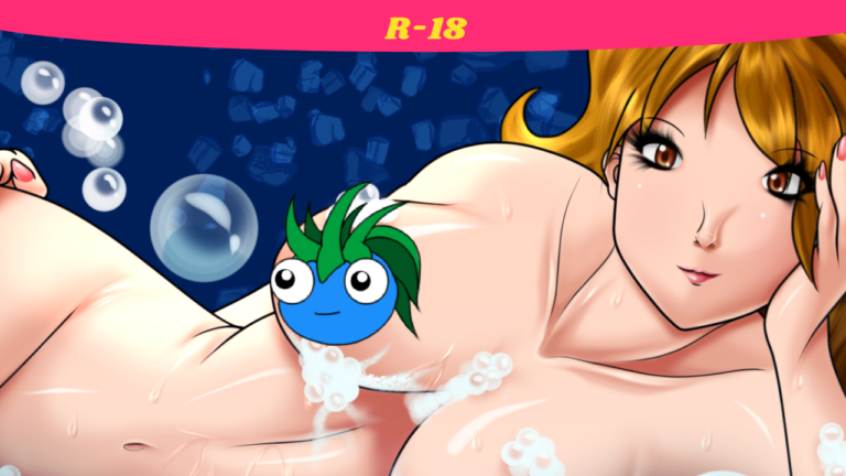
Bubble Popper (Bubble Bath Babes HD)
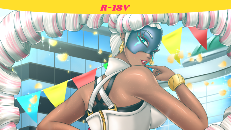
Too Hot To Handle [Twintelle (ARMS)]


